Storyteller, Bowerbird, Philomath.
YASMINE WONG
A globally experienced Creative Director and designer with over 15 years of leading brand storytelling and design across 4 countries, and 60 brands, blending strategic vision with artisan craftsmanship. Bringing ideas to life with impact.


LET'S GET PERSONAL
Straight shooter
Globe-trotting foodie
Toy-collecting
Coffee Addict
Book Nerd
Infinitely Curious
Favourite colour?
Black. Technically - it's a shade, but I'm all for versatility and timelessness over fads and trends.
My go to food of choice?
Buttercrumbs Croissant (Five Dock -thank me later), Kogi Korean BBQ. Hunting for that illusive amazing eggs benny of my dreams.


For the senses, what are your go-to's?
Peony roses, when they're in season and Karl Lagerfeld for inspiration (RIP). Jimmy Choo Floral Parfume for the nose and for the tunes "Carmen" by Joy Crookes on Soundcloud.
Currently reading
21 Lessons for the 21st Century - Yuval Noah Harari, Chromatopia - David Coles, Prodigal God - Tim Keller
Coffee Persona
Al Pacino. I'm a solid strong flat white with an extra shot on Fridays...because deadlines need extra. I'm a dreamer but more importantly, I'm a dreamer that does.
Companies & Brands I've worked on

WORK
Campaigns + Case studies
Click on the grid to scope the campaign. A cross selection of companies
and brands I've worked with from across the globe - some items under NDA.

AFTERPAY

SEAO2

LAPHROAIG UK

FOODINI

SKISPORT ADVENTURE

WESTPAC

WILLOUGHBY CITY COUNCIL

SMIRNOFF

OPTUS

NESPRESSO

NAPOLEON PERDIS

SUNCORP

SAMSUNG S10 LAUNCH
ZIP

MONDAY REPUBLIC

ARTIFICIAL INTELLIGENCE

NEWSCORP

BETASHARES
ASTRAZENECA UK
WOODFORD RESERVE UK


AstraZeneca for Ogilvy Health UK (Pharma)
Senior Art Director, Contractor London, UK
Copyright Notice and Legal DisclaimerAll artwork, designs, images, written content, and other creative materials displayed on this website (collectively referred to as “the Works”) are the intellectual property of Yasmine Wong unless otherwise stated. The Works are protected under the Copyright Act 1968 (Cth) and all relevant New South Wales and Australian intellectual property laws.You are permitted to view this website and its contents for personal and non-commercial purposes only. No part of the Works may be reproduced, copied, distributed, transmitted, published, stored, or displayed in any form — whether digitally or physically — without prior written permission from the copyright owner.Any unauthorised use, reproduction, or redistribution of the Works may constitute a breach of Australian copyright law and could result in legal action. While reasonable care has been taken to ensure all materials and information presented are accurate, no legal liability or responsibility is accepted by Yasmine Wong for any loss or damage arising from reliance on the information contained within this website.By accessing or viewing this website, you acknowledge and agree to these terms.
©2025 Yasmine Wong. All Rights Reserved.
Opportunity
Hired as a contractor for Ogilvy Health - located in Paddington, London. Ogilvy brought me on as an Art director as I had previously worked for them in the main office in Canary Wharf for a previous project. Executed for their oncology learning capability section, diversifying my skillset in illustrating, animating and building modules for the Cancer research done by AstraZeneca for their Cancer unit as a learning initiative on their findings as well as education (Immuno-Oncology Delphi Initiative).
Strategy
With 6 learning modules to deliver in under 3 months before leaving the UK , I was given a lot of trust and freedom to be able to shape and direct each of the modules in a fun, detailed and educational way, based on a functional powerpoint -end of delivery product, which incorporated active participation by animated and optional choice.
Strategy was pre-planned prior to my arrival by the Creative Director as I had taken over this project from another contractor, which in itself was good to streamline creative review processes to get items delivered inline with the deadlines and presentations.
Design
My role in this was to illustrate biological illustrations of the body, cancer and cell mutation/replication. Second to this, was to create and design icons to help explain definitions, different modules and various different graphs, research and statistics. Lastly, was to design implement animations and module functionality as part of the interactivity across all modules created. Provded having gone through rigorous feedback, approval from external client and internal agency.
Impact
So pleased to have announced that the modules went one to receive several awards 1 year after execution. Including:• The project was an awarded Finalist in the Finalist — PM360 Trailblazer Awards• An HCP education/unbranded oncology project about ALK-positive NSCLC progression (ALK = an oncology target).
Awards / results:• Gold at the Rx Club / Rx Awards (2016) — ALK Progression listed among winners.• Also appears as an entry/finalist in PM360 Trailblazer materials (2016).
Illustrations
These Illustrations are some examples created using Adobe illustrator. After receiving the brief from the Ogilvy account manager who liaised the go between relationship with AZ and myself. The Design process included 3-4 rounds of feedback, medical accuracy, creativity and consistency with the final sign off given by the Creative Director, account manager and the client themselves to use in the educational modules.
Gallery Illustrations created for Lung Cancer - anatomical and biological organ/equipment insets
These illustrations were for a separate module defining Cancer, its role in cell replication and the effect of Lungs in particular. A lot of detail had to be looked into for this. During my secondary and tertiary degree, I did secondary electives for medical studies and biology, so this was exciting in being able to approach and understand this in a creative way. It also leant heavily on my years as a infographic designer, to be able to bring together information and creativity that could be interpreted by all ages.

Illustrating Insets
Extra detail went into visualising and illustrating insets or detailed snapshots of processes/diseases that were affecting particular bits of anatomy. It was important to get this level of detail right in order to educate and visually enable future doctors, nurses and medical staff.

Pleuresy
Bronchoscopy
Bronchoscopy 2
Bronchoscopy 3
Hemotypsis
Resectable tumour
Aveoli
Cillia
Heart Cancer
Marrow Cell
Radiation
Cancer of the rib


Cancer staging illustrations - for learning modules
Learning Modules + Developing icons
Six interactive modules were created to educate, visually illustrate research, procedures, statistics and methods on the role of cells, DNA, cancer, and how it affects the human body. The final output was a fully customised animated and interactive module built in Powerpoint, Illustrator and Photoshop.


Examples of Modules + insets

LAPHROAIG CAMPAIGN #OPINIONSWELCOME
Freelance Design Lead, London UK
Opportunity
Rebranding Laphroaig, was seen as a challenge as most brands with an established market look, feel and following had preceded its reputation. Previously seen as an elderly gentleman’s whisky; We wanted to change the narrative for this campaign without diminishing their brand value and losing their current market. (See the original branding of the bottle and packaging to the right)Analysing trends and research from the current market, we found there was a cycle of coming back to the understated and classic. The particular market we wanted to capture was high-end in their tastes, coming into their adulthood already seasoned by the working world, established their style and tastes in how they dress, what they drink and what events they go to. Whiskey drinkers are connoisseurs, more likely to be male and often drink between 7pm to 12pm, this is also reflective of how socially adept they are and often, politically engaged.
Design
The design aesthetic matched the look and feel of the campaign running at the time which was called 'Opinions welcome'. This campaign honoured the divisive and unique taste of Laphroaig as something that wasn't for everyone.Defined by its medicinal, smokey flavour which is attributed as a trademark of the Whiskey as well as its authenticity and transparency with its audience, growing trust and goodwill with the brand recognising positive and negative reviews and reinforces Laphroaig's reputation as a unique, complex, and intensely flavourful whiskey that creates a lasting impressions and strong emotional responses.Deciding to appeal to the nouveau riche - a clean minimalistic look,
flourished with creativity, conversation starters that come from engaging with the academically, creative and astute, but also steeped in tradition, honouring history with the aim of furthering its appeal to the next generation who saw Laphroaig as "stuffy and old".Working on the 10 year bottle and branding, having stripped back the entire product to achieve a more modern minimalistic look and feel was one of the first steps taken to keep the focus on heritage and the whiskey itself. Which is why we went for an all white minimalistic background bringing forward the logo, Royal Crest and the image of The Laphroaig farm.I also went to work on options and possibilities of different logos to signify the 10 year bottle, as it was seen as a special edition. In the end we opted not to go with an additional logo for the 10 year bottle as it seems to distract away from the minimalism and heritage already there.I designed the OOH Poster for the London Bus shelters and various other Public Displays, was designed for a different audience, not specifically for the 10 year bottle but for the younger demographic. The use of a more academic, artsy crowd, that uses the typography to emit emotion, freedom and boldness - in a lockup that was traditional, hero'd the product, encapsulating the Laphroaig line of Bold and uncompromising.
Strategy
• Negative Review Marketing: Turned criticism into an asset with lines like “Like dead fish—I was hooked.”• Real-Time Content Integration: Used algorithms to select the most engaging opinions for ads and social media posts.• Packaging as Media: Featured fan quotes on bottle labels and gift sets, extending the campaign’s reach into retail spaces.• ASA-Compliant Creativity: Maintained compliance with advertising standards while pushing boundaries in storytelling.
Driving engagement in the campaign hinged on enabling the social media hashtag #opinionswelcome in conjunction with their honest opinion of the Whiskey, with the chance to put the audience in the driver seat of being their own creative. The most creative and bravest of the review got the chance to have their opinion printed and displayed openly in and around the UK - again distilling the Laphroaig values of authenticity, bravery and distinct.
Impact
• Sales Volume and brand performance
2016 Sales Reference Point: In 2016, Laphroaig sold approximately 306,000 cases, marking a modest increase of +0.7% compared to 2016, and ranking it as the 7th best‑selling Scotch single malt globally.scotchwhisky.com• General Annual Performance: Laphroaig has often been described as "The world’s best-selling Islay single malt". In 2017, it sold around 3.7 million bottles, which equates to approximately 308,000 cases (based on a standard 12‑bottle case).• Since 2016's sales were 306,000 cases and 2017 reached ~308,000, this infers that sales in 2016 hovered around 300–306k cases.• 2015 Context: Beam Suntory (which manages Laphroaig) reported a strong 23% overall sales growth in 2015, with Laphroaig being a key contributor, alongside bourbon brands.• While this figure reflects broader company performance, it suggests that Laphroaig enjoyed double-digit growth in 2015 relative to 2014.
Right: Laphroaig packaging and branding before the rebrand in 2015 -16. Note the prominent heavy dark green packaging with illustrative logo and Typography.The top of the bottle cap mirroring the dark green packaging - targeted at a much older target market with a "stronger" more "medicinal" taste for whiskey prohibition era.


Top right: The Laphroaig factory located in Islay, Scotland.Above: The Laphroaig bottle pre-prohibition era - note the 7 different fonts that present themselves on the label - stripping this back which you can see on the 10 year old select bottle (white label) down to 4 fonts gives the label and brand a lot more legibility, aesthetic minimalism, and order - attributing to its elevated value.


Concepting for the Opinions Welcome Campaign
From Logo, ideation to Lockup and execution


LEFT : Before the minimalistic lockup, marketing looked at launching Laphroaig and its positioning to include 3 Whiskeys as a holy trinity, being similar in tastes and eating process - for the true whiskey connoisseur
• Ardmore
• Conemara
• LaphroaigHowever - quickly realising that their individuality in bottle shape, size and taste diminished the premium positioning against each other - and so the "3 peated whiskeys" logo was scratched in favour of a clean, minimal look - just for the Laphroaig bottle.Above: Final concept with a focus on the Typography lockup which has now become its signature look for Laphroaig and its #opinionswelcome campaign this focused on keeping a minimal high end look and feel with unique personality represented by the fonts used to express opinions, reinforcing the Opinions Welcome Campaign.Below: Typographic poster lockup

LAPHROAIG
White Label UK - Rebranding
Insight
The importance of linking Laphroaig to their branding legacy especially through a rebrand was quintessential to retaining the their existing customers and evolving to grow and attract new and future generations which represented the spirit of Laphroaig - Bold and uncompromising.The brand up until this point had a large following for the high quality and complexity of the Islay Malt, which is attributed to the peating process, done onsite in Scotland. Acknowledging that it is not for everyone, created a social class of an "elite select" target market - fuelled its reputation of rebellion and class in the one cask is a unique positioning.
Background
Laphroaig was shutdown in the prohibition era in the UK - where Ian Hunter (last member of the Johnson family - founding) flew overseas to the US to expand growth and exploit the 'medicinal alcohol' loophole in legally circumventing the alcohol ban. Which in turn was advertised by many doctors and members of the medical profession due to its iodine and seaweed properties/taste allowed the company to survive and succeed during this period.Laphroaig was officially appointed as a supplier to the Royal Household by the Prince of Wales in 1994, King Charles the 3rd, endorsing the 15 year old whiskey as his favourite - seen on the walls and the Laphroaig product to this day (Royal Coat of Arms - specifically marked for the Prince of Wales) .

Video for Opinions welcome - Creative Director - Greg Saunders, Art Director Matthew Swan for Laphroaig UK / White label UK, London, United Kingdom. Age restricted viewers - login to Youtube to verify your age
AFTERPAY "CARTE DIEM"
Analogfolk - "Seize the deals" Campaign, Sydney AU
Senior Freelance Creative
Opportunity
Whilst working at the same Agency on other campaigns, I was brought on to help out on this Buy Now Pay Later (BNPL) Service. Having worked across retail, Afterpays' direct competitor and multiple live event activation across OOH.Afterpay sought to inspire shoppers to seize the moment, by adding to their carts and enjoying up to 70% off popular retailers and end the day triumphantly. Shoppable WebAR activation called “Invisible Drops”, letting people “unlock” exclusive Dyson, Sephora, Culture Kings, etc. product drops in 3D via QR codes across the site, app, socials and YouTube (no app required). AR build partners included Valis and 8th Wall.“Carte Diem” promoted the August 19–22, 2021 Afterpay Day sale in AU/NZ. It invited shoppers to “seize the day/deals.”Channels & support: TV, OOH, digital & social, with PR/influencer amplification led by One Green Bean
Strategy
Afterpay’s most recent September 2021 Campaign comes fresh off the already conceptualised collaborated and branded look and feel for an invisible drop and shop concept. By only offering exclusive deals via utilising AR codes ranging from technology, sporting goods and fashion targeted at Generation Y and Z for a period of two days, driving sales and encouraging spend with the benefit of discount and deals utilising OOH.As it was the second time running with the campaign, similar branding was adopted across the board making use of assets provided to us via the agency.
Design
Utilising assets provided to me by the AnalogFolk Creative Department, I set to work incorporating a conceptualised designed layout that is reflective of their brand, design guidelines and inclusive of their 3D assets.
Impact
Afterpay's total sales facilitated in Australia nearly doubled from 2020 to 2023, rising from A$7.8B to A$13.4B.The incremental sales attributed to Afterpay (i.e., the net uplift beyond baseline) reached A$9.6B by 2023.2023 (Mandala Report, published 2024)• Total sales via Afterpay: A$13.4B• Incremental merchant sales: A$9.6 billion• Net benefits to merchants (sales + cost efficiencies): A$5B• Contribution to GDP: A$3.9 billion
• Consumer savings: A$127 million


Digital and OOH Displays
Collectively there was 64 assets that I rolled out in under a week for this campaign in various media sizes for OOH. Designed using indesign with final rollout done in Figma.


Social media
Digital collateral made for instagram, Facebook and Google ads


Light animation of social assets
Social (Mobile) animation design using premier pro and Figma assets


Foodini Start-up
Freelance Design Lead, Sydney AU
Opportunity
Foodini is an app made for the atopic demographic (people with allergies). It helps to navigate tricky social situations of eating out with individual allergies and not being able to participate in social bonding because we don't have access to information on whether restaurants will be able to cater to specific dietary needs of someone or a group of atopic people. In the past, eating out takes a lot of stringent research and planning but can quickly turn into a vetoed night out if you aren't near the right restaurants with the right foods.Foodini helps map restaurants and businesses that provide information and can cater to the atopic demographic whether it be gluten-free, dairy-free or nut-free by being able to customise and safely filter options on the food scene, so there is less social and dietary anxiety on a social night out. I was approached by founder Dylan McDonald to help evolve and grow the start up with a view to shaping the design and perception of Foodini in the Australian market having secured seeded funding.Foodini had a great start in the fact that it looked and felt accessible to everyone. It didn't need to look premium but the branding and design of it's identity wasn't consistent and tight in the fact that they were indecisive on what and when they wanted to post, how they wanted to curate their information and the direction in which they wanted to grow, which is where I stepped in to unify their comms (eDMs, banners and print collateral), Social media and website/blog/pitch decks.
Strategy
• Humanizing atopic issues and garnering trust through transparency and information that is easily and readily available. Content is king here.• Fostering trust through partnership of vendors and verification of diets through certified dietitian• Mobile first and friendly design of the app. Making it highly customisable and individualised to you, the customer. Easy UX and UI to reduce onboarding via AI.• A resonating narrative through its Founder - Dylan McDonald has celiac disease and promoting his story as founder and part of the demographic has strong trust factor in being able to sell and use the app knowing that it is used and endorsed by a fellow atopic person.• Turn dietary transparency into a value proposition for restaurants.• Aligned the app with growing consumer trends: gluten-free, dairy-free, vegan, FODMAP, low sugar, etc.• Capitalized on rising awareness of gut health, food intolerances, and medically required diets (e.g. for IBS or coeliac)• Social media to support and funnel business objectives for their events and seed round pitching. Foodini needed to focus on their messaging - the hub of this being that they had a very valid need and demographic that they are catering to, but for most of it, they just needed more exposure and to engage on all of their platforms for this to reinforce what they are selling but also, leaning on content to inform newer members that are living with atopic conditions.
Design
• Previous to having me redesign their assets, their style was very illustrative and bespokely hand drawn but this left the design of the assets and all round aesthetics feeling as if it had cornered itself in a very niche way and slow growth opportunities / brand appeal to show that this allergy-veto issue is not only on the pulse and modern, but conveys quality and innovation in their design approach. Something that small illegible hand drawn items cannot display and would be hard to scale as collateral grew as they would be dependant on artists that drew them.• Continuity of icons and typography, clean minimal grid design to concentrate on messaging and content creation (tone of voice) , with a key focus on story/reel medium as his historically was what got high engagement from their viewership in the past.• Aesthetically cohesive and informative - the look and feel of their website and comms are the same as their other social media platforms so their audience can begin to align who Foodini is, what they stand for and begin identifying how and where they sit with Foodini. Blogs are promoted on instagram, instagram, stories and events are echoed and written up on the website, and communicated via eDMs sent out
Impact
Working with Foodini from April - August 2022, using other businesses of similar size and performance in The Australian market to measure their growth and success 6+months after my design services.• During 2022 - mid 2023 the company went from engaging 2000 restaurants in their app to including 3500 restaurants - that is an increase in vendor growth of 175%• User growth: from a lower base in 2022 (we know pre‑seed round funded expansion, early restaurant partners in a few cities) to approaching ~100,000 users across AUS + US by mid‑or‑late 2023.• Venue onboarding was growing strongly: expansion beyond initial cities (Sydney, Melbourne) into other metro / coastal regions (Brisbane, Byron Bay, Gold Coast etc)• Feature growth: diet/allergen profile support enlarged (50+), more menus reviewed by dietitians.• Social media presence and growth: with the use of instagram, their website blogging platform and exhibitions events in atopic communities their instagram following went from 3500 to 5000 in under a year - this is engagement and growth of 142%.
Foodini branding and design by a previous agency.


Foodini after my re-design
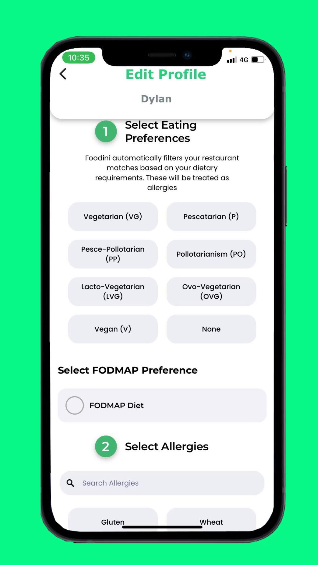
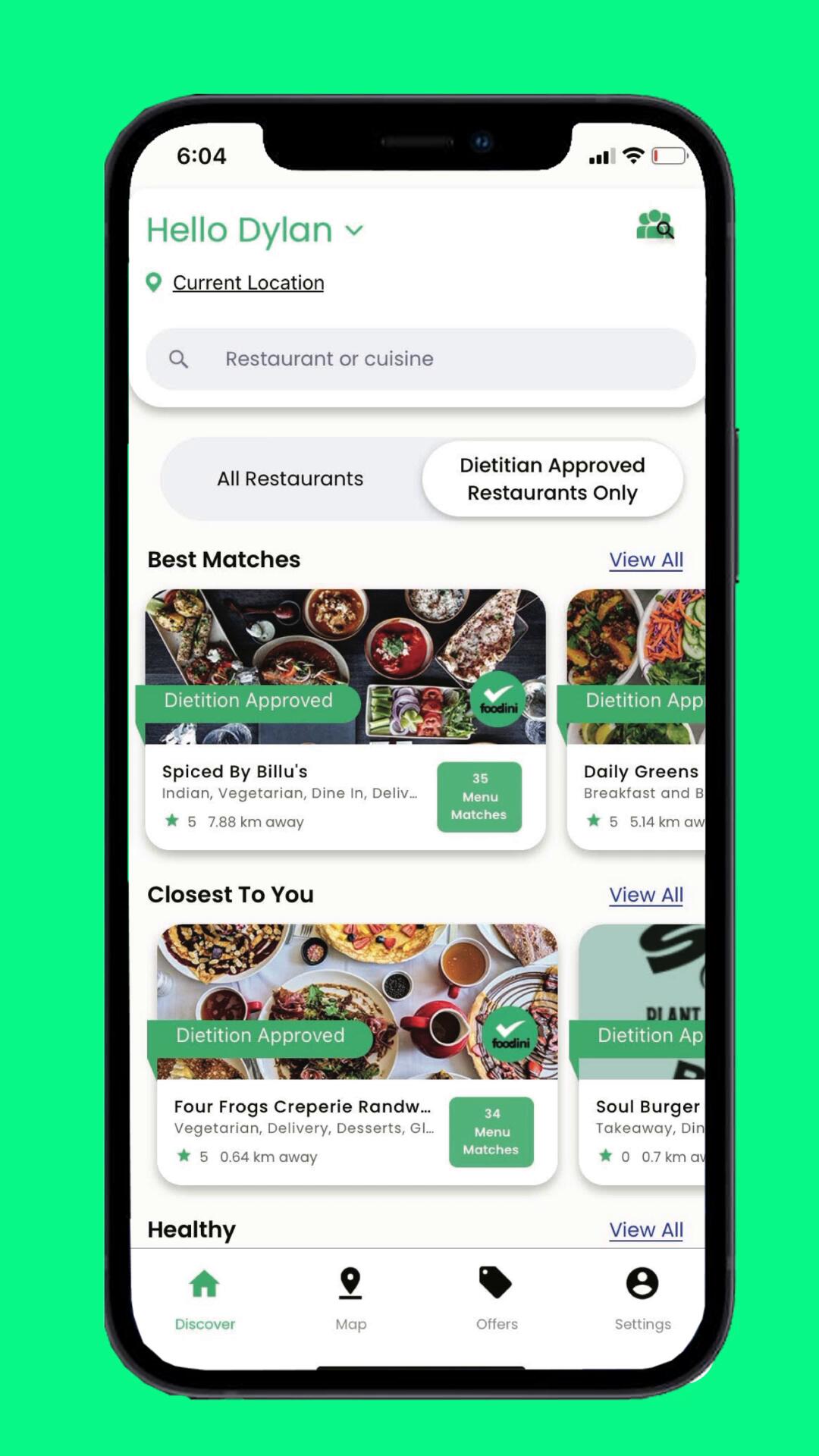
UX/UI design
Designing the selection panel to help automate and filter through the account set up using options like "pescatarian" or "vegan" paired with FODMAP and Allergy selection section enabled efficiency in being able to sort and match the user to suitable restaurant choices in the app.
Social media grid design
Designed with a cleaner clearer grid design, pushing a content first approach, leveraging feedback from their statistics of simplifying content into bite sized pieces (informational+carousels), that is less distractive.

Foodini Social Media - Instagram
Prior to joining Foodini, our follower count was 3,500. After 4 months of managing and designing posts, carousels, stories and reels for both Facebook and Instagram, engagement was up 5024 joined, which is an improvement of 143.5%+ increase


eDMs
The growth of Foodini in being successful over the previous 6 months saw us launching in Melbourne, Brisbane and Sydney.Some insight that came out of the A/B testing was that stylistically for the eDM, individualistic style between Sydney and Melbourne was essential to engagement and signup. Melbourne audiences tended to engage in more of a high end minimalistic style, whilst Sydney-siders swayed more towards 'lifestyle' positioned design and shorter condensed information.


Print Collateral - A5 Brochures
Marketing printed collateral involved concepting, designing and executing production for their stalls skins, brochures, pitches and business comms


Foodini exhibition Shell for the display booth
Designing the shell and POS for the Brisbane Vegan Expo Stall 2022

Apple store app page - UI integration as seen on the display page

Designing the UI
Introducing carded navigation tiles, FODMAP radio selector button and Dietitian approved ribbon for certain restaurants, to help with navigation fatigue. Personalisation of the login menu.

Investor Pitch Deck
In 2022, Foodini successfully secured an angel investor worth $700,000 pre-seed with the investor pitch deck I had designed for them . A great achievement of growth during this time. 2024 saw them secure funding worth $1.8Billion USD and expansion into the USA.


Re-design of the Foodini website
Designing their partner landing page had a lot to do with the feedback we were getting from
customers, as there was a lot of information and the flow and concept of what they were selling was a lot to try and comprehend and so I looked at the internal architecture and broke down the feedback from customers. There were a couple of things that needed to be solved. And focussed on the first three.1. Simplify information in bite sized portions2. A lot of customers didn't connect the dots on the instagram and wordpress site that it was the same brand, so we needed to make this visually cohesive. For that, I designed it with the same look and feel were portraying on the instagram and eDM throughout the landing page, so people can see it was the same company. Moving away from the previous agencies design.3. The sign up process previously wasn't clear, what steps does that involve? how do we become a Foodini partner? what are the costs? Fielding this online, helped stem the bottle neck questions the consultants were stuck explaining, rather then spending most of their time developing programs and events /exhibitions to help further grow and scale the business.

NAPOLEON PERDIS
Freelance print and brand refresh
Design Lead, Sydney AU
Opportunity
Napoleon Perdis had undergone an acquisition (now owned and operated by Livia Wang and Henry Lee) from its origins and had strayed in recent years due to inconsistent branding, reputation damage and media speculation. In a bid to restore and stabilise Napoleon Perdis "back to its roots," we embarked on being able to focus on origin, quality and consistency and what Napoleon Perdis was known for with a heavy focus on the things that matter in the Makeup industry which is technique and training with their course and makeup artistry, quality of mica and pigment in their eye shadow range as well as a big focus on their base range of cult favourites such as Auto-pilot Primer, Camera Finish Foundation, and Cheek switch Créme Blush. Over 100+ collateral items were produced and delivered in a period of 3 weeks.
Strategy
The move to form a more accessible digital strategy and increased engagement across social media (Instagram, Tik Tok, Facebook and Youtube) as well as print, having formed a partnership with Priceline and various other outlets to sell their various ranges.Re- entering the partnership deal with David Jones helped to secure a premium brand positioning with a premium retailer put Napoleon Perdis back in the spotlight as a product not only for professionals but for a higher end market with expendable income.Visually solidify their brand value through visual/design alignment. Currently before the takeover, the visual campaigns produced lacked narrative, off piste with their core brand and look which cheapened the product lines, affecting loyalty and consistency.
Design
Branding and goodwill from the early 2000's onwards had seen Napoleon Perdis change exponentially with the transfer of ownership. The challenge prior to Livia Wang takeover saw Napoleon Perdis being too inclusive and "on trend" - and when brands stand for everything, they dilute their identity, unfortunately.Focusing on driving new products as opposed to building on the products and quality in a bid to stay relevant was the main issue here. Packaging and design was inconsistent with looks, colours and products launching every 3 months not only cheapened the brand but catered to the perception of mass production instead of quality elite.Aesthetically, brand, guidelines and their origins were cast aside. After the acquisition with new owners and stabilised direction we mainly focused on "getting back to basics" with a look and feel that our target market knew and loved with a trajectory on being able to enter new social media markets such as Tik Tok and Instagram Stories in being able to try and capture younger audiences focusing on quality not quantity in the market space we were playing in.Original Packaging was brought back in and a minimalistic nude, sleek look of using the beige, white black and gold brand guidelines.
Impact
Accelerated International Push: KUBA projected international sales surpassing domestic by the end of 2020. They launched into China via e‑commerce with Access Corporate Group, achieving approximately AUD 30 million in retail sales within six months• Restructuring yielded modest recovery: The voluntary administration and store downsizing in early 2019 were critical to cleaning the balance sheet and returning the company to profitability.• New ownership reinvigorated the brand: KUBA’s takeover brought capital, strategic direction, and international ambition, pivoting the company from survival mode to growth trajectory.• Marketing and channel shift were pivotal: Elevated marketing spend, high‑profile partnerships (e.g., fashion week), and the move into David Jones reshaped brand positioning and distribution dynamics, contributing to both domestic and international performance uplift.• International expansion and digital channels served as growth engines: Early traction in China via e‑commerce and expectations for international sales outpacing domestic by end‑2020 signaled a major strategic shift.
Designs and Creative direction previously executed by other designers/Napoleon Perdis before I contracted for them.

Below: Another controversial ad promoted outside of a Mosman shop sparking disapproval of the CEO of the Cancer Council marking the advert as "dangerous and unethical".

Napoleon Perdis is no stranger to controversial ads as you can see exhibited below - however there is a right way to do controversy and a wrong way to do controversy.

Below: For their Double Duty Infusion Lip Oil. Proving the backlash for "all publicity is good publicity" wasn't actually the case (This is a real published ad btw circa 2017)

One of their earliest coined ads ad the time relied heavily on sex appeal, ardent flamboyancy and fashion.


Napoleon Perdis Ads I designed
Catalogue Print Ad as seen in Priceline and David Jones Catalogues

eDM National Lipstick Day

Packaging design for their original Autopilot Primer


eDM Instore Gift and Online Promotion

Instagram tile 1080x1080px

eDM Glam in a Click Makeover Campaign

A4 Print and instagram post for Ad for colour correcting combination


NESPRESSO
The Conscious Organisation. Sydney, AU
Design Lead, Freelance
Opportunity
Conceptualised for Nespresso's Culinary Ambassador Campaign, this was a collaboration of two Australian chefs; Tetsuya Wakuda and Shannon Bennett. Working with The Conscious Organisation, my role was to design 2 versions of the website for the UI and UX for B2C and B2B Market, using their newest models on the feature page in tandem with celebrity chefs.A few things needed to be addressed in designing for the site in order to get across the layers of information, functionality and engagement. Framed around their pursuit of quality, consistency, and precision - something that aligns closely with Nespresso's values and principles.
Strategy
• Aesthetically, wanted to focus on positioning Nespresso as the premium brand to choose. This involved consistency across the brand which went from social media posts to packaging, flyers and print to the website.• Professionalism, warmth and authenticity. With both chefs having established a partnership with the brand, this already signalled a high end representation - of product placement into that Luxury Market segment.• Gourmet dining with premium coffee culture - the chefs featured the coffee and the machines in their restaurants (Shannon in Melbourne for Vue du Monde and Testuya in Testuya's Sydney) as a, luxurious in-house dining experience• The storytelling journey of food and experience through inclusion of video content, echoed on socials and in the recipes on the same site. Re-enforced through their trip to Brazil to spotlight programs like the "AAA Sustainable Quality Coffee Program" which underlines Nespresso’s commitment to sustainability, quality, and traceability, enhancing brand credibility and emotional resonance• Re-enforcing Nespresso coffee in the market as a lifestyle - not just a product
Design
Following on from Nespresso's branding, positioning and guidelines, this project suited my design style and capabilities of designing for minimalism and luxury. Opting for a sleek and premium look so we can use the focal point of 1) the Nespresso Machines 2) Shannon Bennett and Testuya Wakuda, keeping the wireframes and nav bar simple and clean to help the secondary function of driving customers and businesses towards purchasing and or add ons ie. Accessories and coffee flavours/capsules.Using a lot of black and white to play on the edge of clean sophistication with reference to restaurant Chef uniform culture, what that represents but also honouring the colours of the machines, tied in nicely. Both colours also representing different machines and states (NSW and VIC), Chef Jackets - representing professionalism at the helm. Both colours represent a premium look and feel for the brand, customers and chefs involved. I was quite pleased with the overall outcome.
Impact
• 98,000 page views (target was 50,000)
• 80,000 unique browsers across 10 content pieces
• 5,700 social media shares
• 2.47 million minutes dwell time
• 114% increase in purchase intent
• 100% increase in brand association with sustainability
• 275% increase in talkability
• 78% boost in positivity toward Nespresso
• 142% improvement in sentiment toward capsule coffeeFor their Vertuo line cafe machines, with messaging around “Café Living – No Barista Required.”
Reported lifts in:
• Brand awareness (+2%, from 95% to 97%)
• Association with “No Barista Required” (+22%)
• Premium perception of the machine (+9%)
• Perception of making café favourites at home (+8%)
• Versatility perception (+6%)
• High-quality brand perception (+2%)
Light and Dark UI Layout designed for AB testingIncorporation of video for higher engagement and to tie in with their sustainability travel show to promote coffee with the partnership with Nespresso
Shannon Bennett UI Layout (Light)

Shannon Bennett UI Layout (Dark)

Performance Results showed a more positive response to the lighter UI.
Carousels and Recipe tabbed card integration for appeal to tie in with the brand equity, and emotional resonance with your everyday home cook with the message that you too, can be a chef.
Tetsuya Wakuda UI Layout (Light)

Testsuya Wakuda UI Layout (Dark)

WOODFORD RESERVE X MR PORTER
Freelance Design Lead, Zak Media Agency, London UK
Executive Creative Director: Matthew Bennett
Insight
Mr Porter is a premium mens brand targeted at the X-Y generation. Working with Zak Media (London Ad Agency) we worked on a campaign that combined Woodford Reserve and Mr Porter in a move that would promote lifestyle, brand and image. Woodford Reserve is a brand that was originally targeted towards the baby boomer generation.
Opportunity
Rebranding Woodford Reserve demanded subtle inferences to modern culture - A return to origin, a signifier not only of quality, intelligence and social adeptness but also innately, a lifestyle of gentleman that dresses well, is educated and knew their whiskey. We worked on the look and feel of a promotions night featured only in A1 bars - bars that were more exclusive than your average pub.Skilled bartenders that knew their liquors, dressed well and knew how to facilitate the room. Brown was a heavily featured colour that linked leather, whiskey and nostalgia of old. Video media was a heavy feature on their website for engagement, mixed in with a ‘return to old as the new’ clothing range of braces, shaving tools, suede leather and social wiles afforded to those that were reserved but enterprising. This was the mark of a proper gentleman.
Strategy
Having discussed the history and research with insight into the market share in London, the team at Zak Media solidified the way to reach men for this demographic was to have engagement and ppresensce across online, socials and print.Positioning an event invite only at A1 bars we would host a whiskey Woodford Reserve night, featuring curated and specialised bar tenders as both the source of service and entertainment - again driving home the message of the product as well as the flavours using creativity, mixology and a lot of entertainment and skill.The event utilised video for reach - advertised on Mr Porter before and after as well as an Advertisement that was put out in the Newspaper - a medium for the academic named the Manhattan Project. This brand positioning featured the original Manhattan Cocktail, a Modern Cocktail that has historically British ties to the Church Hill family - to celebrate the newly elected governor of New York, Samuel J. Tilden. The first discovery of this was specifically printed in a Newspaper.
Design
My role as an Art Director to come in and collaborate with the creative and rollout for a Campaign pitch over a total of three days, I worked closely with the ECD Matt Bennet and Adam Sanders to hone a fresh, high-end minimalistic look, aimed at the younger target market for Woodford Reserve, focusing on imagery of young, academic, fashionable men that paired them with a vintage "dapper" look to reference that the target market are not only refined but social, fashionable and take the time to curate their experiences.Positioned on Mr Porter - ranked the no #1 mens fashion website for this demographic, the aesthetic we built echoed "return to old traditions" work leather pant braces, glasses, bow ties, cigars and tattoos. Signalling, intelligence, affluence and a nod to nostalgia creativity with a focus on Woodford Reserves byline "A spectacle for the senses".
Impact
Unfortunately no wins by the agency on this occasion - however - a really enjoyable experience crafting this one on a personal level and the scope of work in being able to liaise and create with Zak Media Group.
Mr Porter website featuring Woodford Reserve Event

Woodford Reserve x Mr Porter A2 Poster

SeaO2 x The Allgood Collective x UNSW
Art Director UX/UI, Artworking, Sydney AU
Creative Director: Max Guena
Insight
SeaO2 is Australia’s leading marine environmental services company, passionate about restoring and protecting marine ecosystems. Australian Reefs have been depleted significantly over the last 10-20 years, specifically spear heading marine environments and wildlife in being a big part of the restoration and their main food source (coral) disappearing, they decided to focus on their leading projects The Barangaroo Sea Wall.SeaO2 teamed up with SIMS to design, build and install the ”longest living seawall” in Australia, under the sea at Barangaroo. The 90 metre structure made from 3D printed concrete tiles - mimics the natural habitat features of Sydney’s rocky shores. Specially designed to attract sea life, the structure has been planted with native seaweed creating habitats for other marine species. Headed by leading environmentalists from SeaO2 - Peter Phillip and Giann Minns, they worked closely with The All Good Collective a B Corp Agency and myself focused on environmental and social impacts using their insight and expertise to elevate environmental causes.
Opportunity
Having worked with Max previously on other projects via other freelancing opportunities, I jumped on board, given the green initiative and because it's always great collaborating with someone who has trust in your vision and direction.Our goal was to create a beautiful minimalistic site - starting with the conceptualising and strategy discussion around the 6 purposes of the website which was to:
• Inform
• Educate,
• Showcase the client and their research/efforts, promote sustainability
• Introduce current innovation and collaboration of their two projects: Seaweed and the Seawall, Gain
• Funding for these projects.
Giving them exposure to their cause, opportunity.
• A polished identity, so that council, government, audience and investors can start to take their initiatives, our future and their projects to save our environment seriously.
Strategy
SeaO2 is a collaboration between French Scientists and Sydney University in efforts to ultimately encourage and promote sustainability within Sydney Harbour with efforts and budget to initially pitching this to the university to gain grants to1) Invest in concrete structures to encourage growth of coral and species such as seahorses and fish to "re-build" in and around the harbour.2) Grow and farm using green energy and sustainability practices for the use of seaweed to encourage underwater environments to thrive as a source of food but also shelter3) Seaweed cultivation and positioning within the sustainable Australian green market to encourage consumption and continuous growth and propagation as a "Superfood".4) Promote greener living within Australia.
Design
Using Squarespace, I worked with Max Guena to Design 4 reiterations of the website, retouching and selecting imagery, wireframe and code and testing the website to see how the user journey would flow first with wire framing and secondly with AB testing via client meetings.Having to use a specified template was a challenge, where I had to “break” some of the frame work in order to bring together the aesthetic vision as well as serve the function side of the website (meshing the illustration and photos together). The style we were going for was minimalistic, clean, with illustrations and infographics that I designed from scratch in illustrator.SeaO2 has gone on to be recognised for their work and has attracted a global audience - but more importantly has raised awareness and is starting to make a difference in regrowing and regenerating our oceans and reefs.
Impact
• Before this website went live, the co-founders were pitching business to UNSW and the city of Sydney to be able to get this projected funded and off the ground, however - no one took them seriously until the website was built. Which is where their project now sits in the middle of Darling harbour, fully funded and growing! This was a proud day for the environmentalists.• 100% direct traffic on desktop - the number one source of promotion was through their website and Youtube Channel, that was the main source of where their investors but also business partners UNSW utilised traffic to promote sustainability and green practices within Australia.Independent SIMS/UNSW research on Living Seawalls in Sydney Harbour—including large sites such as Sawmillers Reserve and Barangaroo—reports measurable biodiversity gains:• Species richness up: SIMS reports 115 species recorded on Living Seawalls modules in Sydney Harbour—~20% higher than on unmodified (flat) seawalls. (2025 SIMS update; Eureka Prize media.)
SIMS• Community recovery: Popular press summary of UNSW/SIMS findings notes ~36% more marine life on Living Seawalls panels vs. standard seawalls, and >150 species using the habitat (seaweeds, oysters, mussels, fish). (2024 wrap of Sydney sites.)
news.com.au• Function, not just counts: Peer-reviewed studies show that adding microhabitat complexity (crevices/rockpools) increases biodiversity and can enhance filtration (when seeded with bivalves) and reduce predation on native oysters—key functional ecosystem services. (Multiple studies 2018–2022.)Bottom line impact (Australia / Barangaroo)
• Biodiversity: Consistent uplifts in species richness (≈20–36%) and >100–150 species utilising enhanced seawalls in Sydney Harbour.• Ecosystem services: Evidence for improved habitat complexity, refuge from heat/predators, enhanced filtration via bivalves, and macroalgal growth—all contributing to healthier urban-harbour ecology.
Living Seawalls• Scalable model: Barangaroo’s large installation and co-delivery approach (industry + research + government) provide a replicable template for other Australian urban shorelines
Company profile page
Designed in a clean stack for mobile responsiveness and for a clean and sophisticated look.

Landing page
Designed for simplicity, minimalism meshed with artistic licence thanks to the Creative Director

Infographic
Designing an infographic to explain the marine generation and innovation process that was being implemented. 4th and final version.

As seen on Channel 7, ABC News, Illawara Mercury and Channel 9 News.

SAMSUNG
SAMSUNG S10, S10+
Cheil
Contractor, Senior Creative, Sydney AU
Opportunity
Hired as a Senior Creative to work with the in-house Samsung team within Cheil (Samsungs' Advertising Agency) to help with the conceptualising, launch, VIP Event and rollout of the Samsung S10 and S10+.Samsungs main target market are women in the age range of 20 - 35 year olds that are tech savvy, utilise and rely on their phone to be able to purchase, self promote and influence with an outlook that links retail, lifestyle and aesthetics as priority for the demographic.With the integration of a higher resolution lens into the S10, our focus was to promote the model as a not only a fashionable commodity but a lifestyle purchase with the upgrade of being• Water-resistant up to 5 feet for up to 30 minutes• 3-lens rear-facing camera setup; it retains the dual-aperture 12-megapixel and 12-megapixel telephoto lenses of the Galaxy S9+
• Camera software includes a new "Shot Suggestion" feature to assist users, "Artistic Live Filters", as well as the ability to post directly to Instagram posts and stories
Strategy
As with most of the launch with their models, Samsung hold VIP events for their customers to gain feedback but also to create market efficiency. These events are called VIP Elite. In order to market this to our Australian Audience invitations were sent out and a "Korean styled" open air food market was set up to prepare for the unveiling, which utilised QR codes, opportunity for social media posting and stories (for micro an macro influencers) as well as merchandise which was to be conceptualised, made and launched for this specific market.In addition to this, Samsung care was also launched in the same year, which I was asked to help conceptualise for across their website.
Design
My role was brought on to help aid and collaborate with the in-house Cheil/Samsung creative team. Working with the already established "light through a prism" concept design - this focused on the sense of clean design of incorporating a high resolution lense courtesy of Huawei.Incorporating the gradient and soft pastel colours played to our main target market - the Asian female demographic 20-30 year olds. Conceptualising and incorporating the S10 logo in preparation for the soft launch to the VIP event market with various merchandise T-shirts, Tote bags and Box packaging.The minimalistic aesthetic perpetuating a premium, young and affluent market - which in turn promoted the s10 phone as a premium lifestyle choice.
Impact
• Foot traffic: Attracted over 281,000 visitors during the activation period.• Engagement: Generated more than 289,000 product interactions and 54,000 product engagements.• Social Media Campaign: Achieved over 4,700 campaign hashtags, with the installation becoming the most Instagrammed branded experience at Vivid Sydney.• Media cover: Secured 667 media mentions, amplifying the campaign's reach and visibility.
• Sales Impact: Reported a 124% increase in Galaxy S10 sales compared to the previous year during the activation period.
• Performance Metrics: Viewer Engagement: Achieved a 65% increase in viewers per ad play compared to previous campaigns.• Attention Time: Noted a 29% rise in average attention time from viewers.• Targeted Reach: Ensured that 73% of the total audience was exposed to targeted creative content, optimizing ad relevance and impact.


Above: The Samsung T-shirts which displayed the artwork I created for the in-store retail assistants whilst the S10 was being promoted.

Above: Samsung merchandise conceptualise and delivered for the Samsung VIP event for the soft launch. Each member exclusively invited, received one of these tote bags with the phone and ear-buds.


The launch of SamsungCare+ across their website takes care of their customers end to end user journey, ensuring the longevity, repair and care of their electronic items. This campaign, focused generally on efficiency in being able to swap out your broken phone for an new make and model for a fee. This integrated subscription pricing into their product care line which proved to be not only efficient but also successful as numbers recorder 1.7Billion users actively using the service in 2021.
SUNCORP CAMPAIGN
"Banking you can feel good about"
Contractor, Art Director
The Hallway Group, Sydney, AU
Opportunity
With a focus on the planet and environment, more than ever - the average consumer in Australia had concerns over Climate change being able to make an environmental contribution through investing. This placed Suncorp in a position to champion their concerns towards "Banking you can feel good about" emphasizing not just financial products, but doing banking in a way that supports customers’ financial wellbeing and has positive impact on the planet.But how was this to work?
Solar Home Bonus: One tangible offer was a $3,000 bonus for home loans on properties that had solar power systems installed.
Strategy
Collateral was made and distributed across print, social media, online as well as outdoor with the tagline of "Banking you can feel good about" - re-enforcing the ripple effect of their sustainable initiative and leveraging the interests of audiences towards their concern for the environment
Launch around the same time as the personal transaction deposit account. Tier messaging with further secondary launch of Low carbon and Social impact investments.
Design
As this was a rollout campaign, my role was to support the Creative Director and Art Director in being able to stylise and rollout digital and print collateral using their concept of the "Ripple effect"The campaign shows how small sustainable choices can have ripple effects — both environmentally and for the customer’s financial future
Impact
• Brand platform: “Banking you can feel good about.” Launched for Suncorp Bank on 14 Feb 2022; ran across TV/cinema, digital, social and outdoor. By FY23, Suncorp reported major sustainability milestones:• GHG emissions (Scope 1 & 2): Reduced by 76% from the FY20 baseline• Renewable electricity share: 77% of electricity consumed came from renewables (on track for 100% by 2025)• Group advanced Scope 3 baseline measurement and developed net-zero transition• The Suncorp Bank received Climate Active Carbon Neutral certification for its "Service" (personal transaction deposit accounts) as of FY23Investments:• Low-carbon investment: A$378 million• Social impact investments: A$3 million• Combined, these represented 6% of shareholder funds towards low-carbon/social impact investments• Suncorp’s total home loan book grew by a “blistering 6.2 per cent”, as reported by the Australian Financial Review


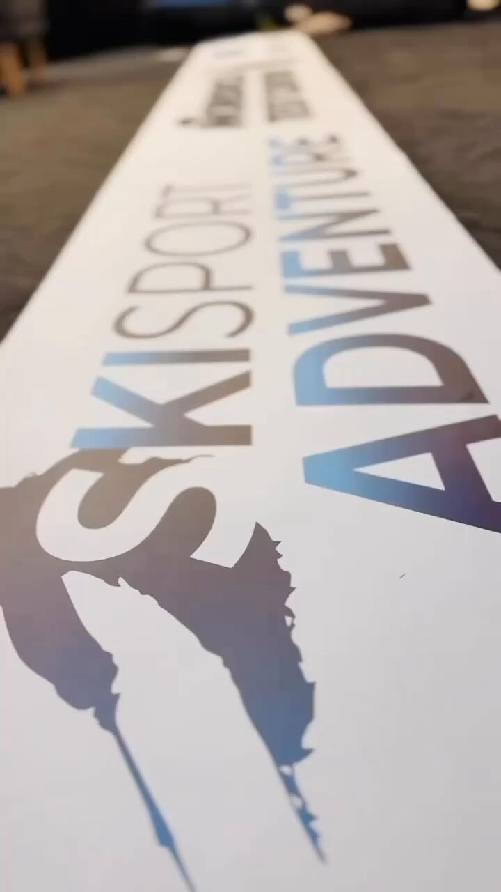
Skisport Logo Sydney/Japan/Austria
Creative Director, Remote Freelance AU
Opportunity
Skisport Adventure is the brainchild of Hansjörg Rumpold - a former Austrian Olympic Ski trainer and highly accomplished professional and native Austrian. Based in Furano, Hokkaido Japan, I was contacted by him via recommendation to help with a logo design for his new company.The target market for his company was aimed at avid skiing professionals and the Japanese skiers all season around - Furano known for its dramatic landscapes, drawing visitors year-round, whether for the vibrant blooms of summer or the excellent snow.Hans wanted something that was contemporary, modern and timeless. This logo had to be versatile, appeal to the asian market as well as European market. On top of this, he wanted this to be flexible enough to go on merchandise as well as comms. An ambitious ask, but I was game.A exciting brief, is one that is product specific, no constrictions on creativity other than 2 types of lock-ups and a client who knows what they do and don't like.
Strategy
• Understand and get the design process down to a succinct representation of something simple, timeless and aesthetically pleasing, I embarked on working through versions of logo design with Hans to come to the Logo design of Skisport as it is today.
• Adhere the branding and logo across various points of merchandise such as jackets, ski's beanies and helmets.
Design
• 2 versions of a logo design that was timeless and flexible that represented who they were and what they did.• Application of Logo to Merchandise and Comms to cement brand and identity via clothing, website and social media.This logo had gone through several stages of ideation as the brief was fairly vague -"Something to do with skiing in Japan minimal with maximum impact, but also, want the logo to be versatile because I plan on making merchandise to go with it, as part of my brand". Initially focusing on external environment of skiing itself as a challenge in itself, exploring formation, brushstroke, reduction of line, pattern and size. Realising that listening to the client, so passionately talk about technique, precision and angle of how he trains his clientele - was the key all along.I started to focus on the notion of movement, angle and technique of skiers - the 'S' bend and the best way to manoeuvre through the snow is all chalked up to how you lean in or out of your ski's. Combined with this, I illustrated the correct ski technique with the photo provided to me by my clients and silhouetted it in a reverse 'S' making the logo typographic but also graphic. The second logo took the ski person and the movement of snow as well as the pine trees and traced it in the background - the problem was, the client loved them both. And so we kept them.
Impact
• 2019 - 2020 was a hard year to assess growth as COVID-19 hit internationally around the world and growth and metrics could not get a read on how well Skisport is doing• As an aside - my designs were unknowingly assessed by one of Hansörg's friends - who is a Austrian Creative Director for Redbull Events. I was told "Its a really great and versatile design," which was nice to hear.• Their dual logo has now gone on to be manufactured on skis, helmets, jackets, gloves, beanies and so much more. Employee count went from 3 instructors to >6 and has expanded to China, which is a sign of inferred growth of the company.
Initial Conceptualisation


Final Choice, refining and colour ways
Skiing and snowboarding is very much about how you move and the nuances of positioning your body. Hans was very particular about technique, efficiency and fun but most of all, enjoying the environment. This led me to focus on combining how snow moves when you ski/snowboard to the finish line, the up kick of powder doubling loosely as pine trees is what you see in the stroked first logo.The second typographical logo focused on contrast of the letters for legibility - sans serif. The first letter "S" was juxtaposed against the tilted skier. To echo the same concept of movement, I picked this letter purposefully to bring cadence and boldness to the design as well as highlighting in an abstract way, how a skier/snowboarder would make their way typically down the slopes in an 'S' bend.The feedback for the foundation of the logo was positive. Not being able to choose one of the other, Hans decided to go with both for aesthetics and practicality of multi-application on future merchandise.

The final colour choice was the blue gradient. For visibility and for what Hans felt like was representitive of snow, ice, temperature and for a more professional ski brand.The final synthesis through all of being able to execute the logo, was having to test out the way that it scales. Designing is one thing, but applying it to many things over time demands that it not only be legible but have legibility and clarity from a distance.Snow boarders and skiers alike need to be recognisable from afar but also near for visibility, and group recognition when locating each other and or camps. So this was definitely essential.


Logo application on merchandise/snow gear


Optus - Senior In-house Creative, Sydney, AU
Yes Labs, In-house Innovation team - Design Lead
Opportunity
Contracted initially into their Yes Lab team on a rolling week to week basis, Optus extended my contract to be apart of their in-house team, supporting the rollout of their events and apps including:• The bid for English Premier League with the launch of their media channel Optus Sports (mainly to do with their pitch deck, print and digital collateral• Rollout of Olympic Material across OOH in and around Sydney (positioning Australian Olympic celebrities such as Usain Bolt)• Launch of an app for the Yes Labs innovation Team called GEOX, a social network-based heat tracking app for events• Smaller jobs supporting their local retail shops focusing on POS for their Xbox with print and digital collateral.• Coincided launch of Optus NBN
Design
Optus had gone through a fresh rebrand that coincided with quite a busy year, having Launched the Usain Bold Relentless Improvement campaign, rolling out consistency of the new branding, tone, primary and secondary palette across different formats for Bus wraps, Floor Decals, posters and TVC Ads, I was asked to temporarily help the main inhouse team, granted my agency background. Having been involved with cross functional teams, so there needed to be a focus on consistent brand identity, flexibility in being able to design for print as well as the digital space. I was also put on the EPL Optus Sport Channel Launch and the pitch for the NBN (which we won).Switching from UX/UI, to Digital, print and pitch deck mode is exciting because no, two days are ever the same, however it does require dexterity, patience and focus to be able to remember comms and specification between teams, Guidelines, personality dynamics and being able to deliver everything without compromise on quality whilst still maintaining harmony but most freelancers /Creative Directors know this very well. As this is part of the everyday grind.
Starting off in the Yes Labs Innovation team - this role was more exploratory as they received funding to help push side projects from their innovation hub. Having been onboarded through a short stint of freelancing, I was asked back to take on some rebranding and innovation concepting as lead designer. I was given free reign to design an app called GEOX which was a linked social network based heat mapped events app made for Gen Z and Millenials to be able to "make socialising cool again". Something that had been waning since the Sydney curfew/closure of bars and nightclubs due to drinking and violence.
Strategy
• In early 2016, Optus signed Usain Bolt as its brand ambassador with a major campaign themed “Relentless Improvement”, aligning the sprinter’s dedication to excellence with the brand’s telecommunications• The campaign was multi-channel:• Documentary-style TV commercials, filmed in Bolt’s hometown (Kingston, Jamaica), showcasing his discipline and motivation• Management of the “lightning bolt” pose in marketing assets, including its integration with the Optus network• In‑store, digital, and out-of-home (OOH) activations, including retail displays across Optus stores and city environments.adnews.com.aufinsbury.com.auExecution & Recognition
• Production was executed efficiently: A complex rollout of 300 campaign collaterals across 400 stores nationallywas completed in just 14 days, half the typical duration—paralleling Bolt’s speed
(as quoted by Finsbury.com)• The campaign earned global recognition—a six-second Optus bumper ad featuring Bolt made it into Google’s inaugural YouTube Ads Leaderboard: Bumper Ads, ranking 17th globally, among ads from brands like Samsung, Nike, and Coca-Cola
Impact
• The campaign helped shift public perception: by the end of 2017, Optus had improved from being seen as a “second-tier” carrier to being ranked best overall in voice and data as per the P3 Connect Mobile Benchmark—suggesting a substantial improvement in brand strength and customer sentiment• EPL investment in 2016 was a powerful growth lever—driving record post-paid subscriptions and boosting entertainment value in Optus offerings.• The Usain Bolt campaign offered strong creative synergy, bolstering Optus’s network positioning through emotive storytelling, operational excellence, and tangible brand perception improvements

Print A3 Posters for Optus
Left to right: Premier league feat the launch of Optus Sports, Xbox One, Console plus Lumia Smart phone in-store display, Premier league feat Optus Sports and Optus NBN


Zip Co/Zip Pay Rebrand + Identity
Freelance Design Lead: Hallways Agency, Sydney AU
Opportunity
The Hallway Group had hired me due to my previous in-house role - as I had worked for Zip previously with their immediate marketing and design team to create some of their original material, I knew the processes and vision and now was faced with an exciting opportunity to refresh their branding outside of it for an identity that suited their Services, Audience and Goodwill that they exuded within their Market in the Fintech space.
Design
Having previously worked for Zip with their in-house creative team I knew the opinions and thoughts around their existing branding from the original team which gave me an edge and insight. Zip felt their branding to be heavy, clunky and "technologically stunted".They had recently had a logo refresh done by agency Koto with the acquisition and merger of Quadpay -incorporating a new logo to cement its new identity. Fresh beginnings along with a fresh colour palette - their main target market looked at women in their 20's - 40's who utilised their services the most.The "Frame" which formed the "I" in ZIP became a focal point and design tool for Zip, wanting to focus on efficiency and shop for the things that they wanted and mattered. Simple to execute creatively at scale, having 91,000 retail partners (merchants) globally, Australia was the Parent Company.
Strategy
• With the acquisition of American BNPL Quadpay expanding the market within the US, a push for a unified brand was needed without having to pivot away what Zip represented
and to still maintain appeal and relevance to their main target market - younger digital shoppers / mobile-first consumers• Zip set out to market itself as a lifestyle choice for the digitally savvy, efficient, putting customers and merchants at the centre of the experience, showcasing their needs and stories. Promoting brand awareness, flexibility and versatility in their offerings and marketing.
Impact
• Higher brand recall & a more consistent global identity. The unification of Quadpay/Zip under one identity removed confusion in cross-border activity and gave Zip a single mark to push on merchant checkouts and OOH.• Stronger creative fit for younger shoppers. The “Can I Zip It?” social approach targeted mobile audiences and internet culture, consistent with Zip’s target demo (younger, digitally native consumers).• Revenue & profit (ANZ): In FY24 Zip reported ANZ revenue of ~A$417.4m and ANZ delivered record cash EBTDA of A$33.0m (FY24). This shows ANZ remained a meaningful revenue base during the years after the refresh.Total Transaction Volume (TTV) — ANZ: Zip’s FY24 group TTV was A$10.1b (up 14% YoY). Zip noted the Americas drove much of the growth, but ANZ also contributed — with some quarters showing flat or modest ANZ growth; Zip noted ANZ returned to growth in 2Q FY25 with TTV up 0.4% YoY for the quarter and a 10% increase in Australian TTV in December (holiday buying). This shows seasonal boosts and a general recovery in Australian consumer activity.Active customers & merchants (ANZ exposure): Zip reported active customers around ~6.0m (FY24) and merchant numbers north of ~79k globally; active customers were broadly stable/slightly down YoY in some reports (Zip’s growth in customers has been strongest in the U.S.). The refresh helped unify global awareness but did not produce a sudden spike in ANZ active-customer counts that is public.
Before the rebrand
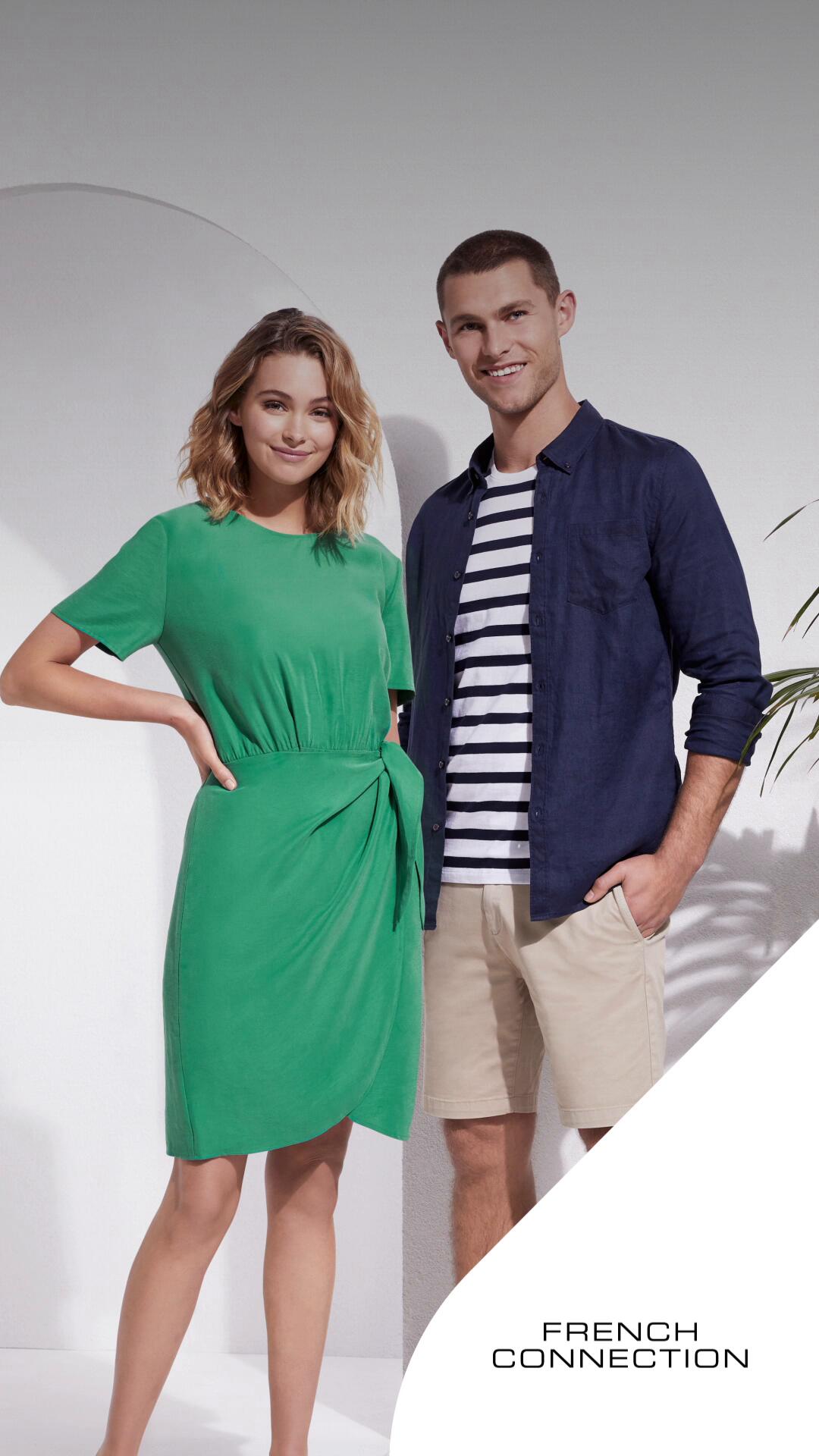
Prior to joining The Hallways on the rebrand, I had worked in-house at the Zip HQ in Sydney CBD a year before. Colliers in-house agency has set the style and design and I expanded on this to help position the brand aesthetically more towards a 'lifestyle' look and feel throughout their digital assets as well as comms and UX/UI.Our main target market were women in Australia and retail shoppers and I was lucky enough to be allowed free reign to pivot the design ever so slightly to allow high-end retailers such as French Connections as well as basic household brands like Kmart to seamlessly co-exist on our platforms.The key to this was consistency across all branding to unify the look and feel but also to garner associated value and brand awareness.The one constructive critique on this initial lozenge style guideline (by colliers) was that it was fun but lacked dimension and sophistication that fashion shopping brands bring to women in market. Not everything needs to be top tier design but the data showed a reluctancy to invest in a company that looked a little clunky.


After the rebrand
Using research and data about the emerging new shoppers who are the biggest users of Zip (Gen Z and Y) catering to the very ethos that Buy Now Pay Later use - which is to live in the now, pay off later with little to no credit risk on essentials and to still maintain authenticity and lifestyle. Time is a precious with this generation - having to cultivate and optimise their life, we shed the amount of copy on the ads, app and digital /print collateral. We are in the era of the self sufficient generation.


NOTHING TO HIDE | SMIRNOFF
Zoo Republic Agency, Sydney AU
Art Director/Artworker
Opportunity
With four new flavours to launch within the Sydney market, I was contracted to Zoo republic in collaboration with Leo Burnett/Diageo and put to work on a number of their campaigns. This one, more notably due to its exposure across Sydney, featured in JC Decaux Bus stop displays. My role at zoo was as a freelance Senior designer, to roll out the artwork across different sizes and mediums and collaborate with Creative Director Edbert to ensure delivery and execution of the design was completed conceptually and technically.Smirnoff targets Millennials and Generation Z, who value authenticity, social responsibility, and creative self-expression. This demographic appreciates Smirnoff’s commitment to sustainability and innovative marketing campaigns that resonate with their values.
Design
With five new flavours to launch within the Sydney market, I was contracted to Zoo republic and put to work on a number of their campaigns as a senior designer. This one, more notably due to its exposure/controversial nature across Sydney via OOH displays with JC Decaux.Artworking and rolling out the design across different sizes and mediums, collaborating with Creative Director Edbert to ensure delivery and execution of the design was completed conceptually and technically to the Smirnoff guidelines.
Strategy
• The launch of Smirnoff Pure was to appeal to the younger market of vodka drinkers aged 20 - 30 years. The move was based on the market being less attracted to alcoholic drinks, marketing to a demographic that was more health conscious, this was a go between bridging the gap between soft drink market and the alcohol market.• Marketing fresh, fruity flavours such as orange and mango soda, Pure Ginger, Lime & Soda, Raspberry and• Digital & social distribution via Pedestrian.TV channels and video platforms (Vimeo / likely YouTube / Facebook), plus earned press coverage in trade titles (Mumbrella).• Advertised as a experiential campaign to begin with, focus was particularly on digital ads and socials.
Impact
• Product Introduction: Smirnoff Pure, a 4.5% alcohol by volume vodka premix range combining vodka and natural ingredients with no preservatives or artificial ingredients, was released in September 2016.• 2017 Performance: In the 2017 financial year, Diageo's net sales in Australia increased by 3%• Ready To Drink (RTD) Market Share: In 2020, Diageo held a 22% market share in the Australian category• The RTD industry in Australia grew at an annualized rate of 2% over the five years through 2019-2020, reaching $241 million in revenue

Challenges
One of the realistic challenges that faced this project was having to end the campaign prematurely as - controversy over positioning the alcohol mixers as 'healthy' for young teenagers sparked controversy.However, following the guidelines around the Advertising industry standard - is important and a clear disclaimer was set that the OOH displays are set 300 meters away from any/all schools so as to minimise influence and and labelling and branding does not falsely advertise what is in/on their brand - Smirnoff uses only natural ingredients (as stated on the label) and is not positioned as a soda or soft drink as per the drink wise label (bottom left).


WESTPAC CAMPAIGN
Freelance Designer, CX Lavender Sydney, AU
Opportunity
Westpac was under the guidance of Interbrands when it decided in its 200 year old history to entrust the agency to modernise their branding to gain new market share with the ever changing landscape with a younger generation entering into first home ownership, banking, accounts, navigating finance as well as evolving media and brand partnerships within their overall goodwill umbrella.Attitudes and perceptions were shifting and eager to onboard the new and savvy generation initiated into The Australian way of life.
Strategy
Strategically, I did not set these guidelines as I was contracting
for CX Lavender but the tone and brand had already been established.Following on from this - guidelines for Westpac couldn't afford to deviate in a polar way from a rebrand that had already been established in their brand and concept - as this would lose the goodwill and brand loyalty Interbrands had already been working towards - however small pivots for more consumer related content found that illustratively - this is where customers lingered and engaged with the brand the most.

Design
Subtlety, creativity and bold, clever illustrations that represented Gen Z and their lifestyle. Most of the work I was working on during this period was collateral for St George Bank, Westpac core payment digital collateral, Bank of Melbourne, NBN and Bank of South Australia
Impact
• Scam awareness campaign
The CX Lavender campaign to make a generation more scam‑savvy suggests that Westpac took initiative to respond to a public need (rising scam losses during pandemic), which could help build trust. The publicity / engagement from that campaign likely had impact, even if not quantified in the public sphere• Improved digital experience, gaining external recognition, and aligning Westpac’s brand more towards relatability and younger demographic.• Revenue and core earnings
From the FY22 investor discussion pack: “core earnings excluding notable items” increased from FY21 to FY22.• Expense and cost control
The FY22 presentation notes expense reductions (e.g. “Expenses … down 3% over the year”) CX Lavender improved efficiency by reducing friction or customer support load

Fast Track to Easier Living
Opportunity and Insights
People continue to shift away from cash transactions, embracing digital alternatives as convenient and safe ways to pay for goods and services.But for many businesses and consumers, cash is still a big part of the way they pay and get paid.Covid presented an opportunity to accelerate the shift to digital payments and reduce the reliance on cash and, in turn, the cost of managing cash in bank branches
Audience
SME and commercial customers
Focused on high-cash users, identified by:
• High BEDs deposits
• High in-branch cash and cheque deposits
• Key Industries - Hospitality and Retail
Challenges
The use of cash is not driven by businesses. 62% of small businesses say that consumers are the main barrier to accepting more digital payments. We need to help businesses understand and communicate the mutual benefits of digital payments, for both them and their customers, to encourage and shift in payment behaviour.
Strategy
Digital payments aren't new. But by hero-ing the efficiency and how easy it is to make these payments digitally, it not only streamlines life but also business. Everyone benefits and together - we create a better experience.
Design
My role in this was purely concept driven as these ideas were highly vetted through the CD to begin with - followed by approval via executive board and then roll out for the design across collateral.CX Lavender sought to appeal to the younger generation through animated graphics, softening and illustrating everyday concepts so it would be easier to digest. COVID was a large motivator in this creative direction as we worked from home to stop the spread and focused on the message whilst everyone dealt with lockdown in different ways, studies showed through testing that there were more positive associations with light, simple designs and compositions that reflected lifestyle at the time (lockdown) but also, that of the Gen Z generation - easy, efficient, community based/support/comfort.
Impact
• The success in a credit card launch suggests that the creative/digital collateral components were effective at meeting or exceeding internal performance metrics (though exactly which aren’t disclosed).• The fact that Westpac retains CX Lavender long term suggests a positive cost‑benefit, at least from qualitative or portfolio‑level measures (e.g. customer satisfaction, brand equity, compliance / risk mitigation in scam education, etc.).• In the Westpac “1H22 Interim Results Presentation & Investor Discussion Pack”:
They report that 83% of credit cards sold in 1H22 were sold via digital channels, compared to 71% in 2H21 - attributing to the promotional ads promoting digital payments via their cards• The Westpac Card Tracker reports that in mid‑2022 (e.g. July, August) card activity (transactions made with credit & debit cards) was substantially above pre‑COVID levels. For example, in late July 2022 the index was “nearly 10 points above its pre‑COVID rate” in terms of activity growth.

Mobile ads
Fast-Track to easier living

L-R Concept through to execution:
"Just the way you like it"

eDM on tablet
Fast-Track to easier living


St George Bank and Bank of South Australia
As these banks are part of Westpacs Subsidiaries, I was also assigned to design for their OOH (Out Of Home) collateral, digital loan ads as well as print publications


St George Bank
Mobile, digital and OOH Ads

St George Bank Digital Ads
Below and above are small examples of concepts worked on - others, which have gone to air are under NDA*


Newscorp X AnalogFolkAgency
UX/UI Designer/ Senior Digital Designer Sydney AU/
Hong Kong CN
Opportunity
Newscorp Australia has been well established over the years, and is synonymous for its news content and prestige associated with various other branches that Rupert Murdoch owns underneath their brand umbrella - namely Vogue, The Australian and News.com.au. Working and freelancing for AnalogFolk was a lot of fun working in and with the team in being able to create Newscorp’s evolving brand identity but also cross collaboratively working with AnalogFolk’s team in Hong Kong for what now currently exists on their site.
Strategy
For the brief, we created two separate looks, taking into consideration their love for high end editorial content and the more modern minimalist look - as the executive leadership team both valued their already established goodwill across content, nationally and globally but also to incorporate innovation via UX/UI platforms given that it needs to compete strategically on an international stage given the current market lean towards live video content and integrity of news being put out. At its core, Newscorp wanted to honour our Australian roots, our history and our indigenous heritage with a strong nod to our artists and the art of Storytelling - something inherent in Australian culture, news and their brand. The editorial concept was not chosen in the end as they favoured a more modern look and feel.
Design
An eDM, Website and Desktop collateral were designed to meet the above brief and executed cross collaboratively with our respective international teams using Figma, Indesign and Photoshop. It’s been a rewarding journey and a pleasure working with AnalogFolk and Newscorp on this and I’d do it again in a heartbeat- many thanks to the London and Hong Kong team. This is also now live to check out here
My Design was not chosen due to differing choice of design taste. My design was noted as too editorial, choosing a more masculine design - headed by the Hong Kong/London team. However, I was brought on to add certain elements they liked from my designs to create a visually compelling and engaging design
Impact
• News Corp Australia notes that during the early days of the Paris Games its digital properties achieved 126 million page‑views on news.com.au plus 18 million video plays (up ~38% from Tokyo).• An audience of 12 million in April and reached over 12.68 million readers in a recent month, making it one of the most-read news sites in Australia, according to Crikey and Mediaweek.• High engagement: The site delivered 322 million page views in a recent month, which indicates high engagement from its readers, Mediaweek reports.• Daily newsletters during that period had 420,000 opens in the first ten days.
Website design
Design Draft Stage 1. A trend research in carded categories, video and live channels all high engagement attributes for their site.1) The main questions we asked were: How do we make news cool again?2) What keeps people Engaged and locked in?3) How do people prefer to navigate? Expanding tabs, carousels or sectioned links?

Design Draft Stage 2.Questions asked: The rise of meta tags. popular news should cater to the audience of Newscorp. LIVE Video updates (during covid-19) was the biggest searched for topic.There's a lot of news to be covered- dometic and international , how do we categorise and design to minimise scroll fatigue?
For this, we looked at time:
Present news (header)
This week in review (mid section)
Popular articles and Latest Articles (End section)

Design Draft Stage 3At this stage we had decided on hierarchy of structure according to feedback.• They wanted to see something a little more streamlined, clean lines that put media coverage first• Simple click through links that didn't make viewers have read everything. Visually compelling, functional links.• Priority news given to national Australian news. International headlines can be sectioned below in Live news feed.

Editorial Newscorp styled Landing page

Editorial Newscorp styled eDM

Editorial Newscorp styled Feature page


Betashares + Betashares Direct
Senior Creative All rounder Sydney, AU
Opportunity
Betashares is a company that is very unique to the Australian Financial industry. Having taken on and modelled themselves on an American business model for creating and selling ETFs on the financial market, they positioned themselves as set for exponential growth with only two other competitors. With the founders having worked steadfast in the financial industry all their lives, it was exciting to join a team that embraced change and innovation so readily.Their branding and design lacked inspiration and direction, having adopted a look and feel that didn't resonate or connect with their audience and therefore lacked trust in the market. Which led funding and investing at a low.
Strategy
Having been asked to go through their design of their website in a graphic style audit, I sat down with the Creative Director to chat about how he saw Betashares growing and the style and direction he wanted to go for. I broke down a couple of notes looking at their collateral.• Streamline consistency - this is quite important to 'glue' company identity, design and brand together. What I found on their website and app was almost 3 different entire styles of 3D shapes, Newsprint collage graphic styles for articles and a photorealistic approach to their videos and print media.• Get the basics down right first- this includes, setting up open and regular communication between marketing, design, developers and sales the set up of a weekly WIP, so everyone is working towards the same goals.• Ensure staged reviews and approval processes were put in place for the design and marketing team so were not operating in miscommunicated silos• Cross collateral cohesiveness when rolling out campaigns for different platforms - print, digital and social, adverts via our Betashares Direct app.
Design
Conceptually and creatively leading the marketing team to be able to promote their core product of ETFs. Some responsibilities achieved including the design and implementation of the UX and UI of their current website in under a month for their superannuation fund in merger with Bendigo bank, maintaining content and creative direction and design for their social media, campaign, webinars and everyday online and print promotions/publications.
Impact
• Achieving profitable growth for the 12 months that I was brought on to contract for them - the growth profit was 7+ Billion dollars in exponential growth. Which was great to see and be apart of.• A new events booking platform I designed to organise their events and booking.• Designing for their new superannuation site merger with Bendigo bank.• Taking over their newsletter design - in 6 months since the takeover, we were voted most read financial newsletter for our industry sector that year (2023- July 2024).• Earning two new awards by end of 2024 including:- Money Magazines Best of the best award for innovative ETFs across 5 categories
- Money Magazines Best ETF Manager (Betashares Direct app)
Challenges
• This project was completed in collaboration with a relatively new and developing creative team. Given their limited design experience, I often took initiative in guiding design decisions and ensuring deadlines were met• For a design team of 4, the scope of work was quite large and daunting for the new and enthusiastic team members. Having had the only agency and freelance experience, it was challenging to mentor experience and processes most of them had never had before but something that I readily accepted and tackled under stringent deadlines.
Design Audit and analyses of their style - Continuity, Consistency rooted in Design style
A graphical style that I had worked on for 4 days whilst observing their current style and guidelines. The aim was not to change it entirely but just to lift it enough and make it familiar for Betashares customers so as not to alienate the market entirely with a brand new look. In retrospect, the brand had inherited and perpetuated slight hampering of growth by not evolving out of this style, which are usually reserved for journalistic articles and less for fintechs, connection to the familial is important but its important to retain some visual resonance instead of going completely arty. This, would go on to be approved and used by the CD and the design team.
Advisor Explore page UX and UI
This was one of the first pages I designed using Figma across a remote team located in Melbourne, Brisbane and Sydney. The aim of this page was to be used as a resources and self help page with the sole purpose of education. Which is why insights, articles, downloadable documents, videos and reports are all in the one place.I designed using a card carousel functionality using the visual icons and responsiveness across mobile. Floating menu's helped with being able to navigate efficiently as well as the dynamic mega menu featured down near the footer for encouraged sales, information and sign up for customer conversion.A conscious decision to use lozenge buttons which saw an uptick in engagement from previous months from our previous site, which was a great indicator to witness 1 month after the design. Accessibility of information also reached an all time high as we were voted Best ETF company consecutively for 5 weeks, beating our competitor Vanguard for the first time in years. (before I finished up the superannuation site)

Events Booking and Webinar page UI and UX
Our Sales and Events team had briefed me in on this project page which they had issues with being able to book stakeholders into their events via a very manual CSV excel sheet download which they used the program cvent to garner interest and bookings for their event.This was exciting in being able to streamline systems and make the booking process not only aesthetically pleasing, but also functionally innovative - as the company was starting to feature. more events across states, which signalled a growth and interest in Betashares.Implementing a collapsable menu for the state locations, time and availability of attending members, it achieved two things1) Drove traffic to rebook, convert customers and to stay informed2) Doing away with the tab system menu - using the state icons instead, so people booked correctly for their intended state. Having access to after hours webinar videos for education and further engage leveraging on content.

Designing Graphic tiles + cards for website articles plus weekly newsletters (articles linked)


Betashares Social Media and Digital promotions


Print Collateral


WILLOUGHBY CITY COUNCIL
Creative Design Lead in-house
Opportunity
I was asked by a friend to come onboard with her at Willoughby City Council to cover her maternity leave as Design Lead. As it was an exciting time after COVID-19 had started to open up venues and activities, it gave way to being able to get back into the groove to create and shape our now modified reality to bring vibrancy and hope back into the city's north shore.
Strategy
Working closely with the in-house events team, the city mayor, accounts sector for sustainability initiatives, Youth council as well as liaisons with external stakeholders the local community, arts, artists and events stakeholders - being able to implement a strong design process for a small team was paramount to avoiding bottle neck /work pipeline issues. Part of this was to implement:• Consistency and quality across the different sector whilst adhering to different stakeholders timelines and brand guidelines - file naming conventions, allocated folders and implementing an online portal where access for external stakeholders to download files and collateral for their business needs• Templated presentations, brand guidelines and updated /regular communication across teams so we could maintain version control but also streamlined sign off processes to help with rolling out collateral to relevant events/stakeholders.• Prior to Karen going on maternity leave, most of the teams were siloed in their processes. I started to organise WIP meetings to help with communication and transparency to reduce confusion.
Design
Some items I was given material by exhibition events organisers and other projects I was given free reign to design, so a lot of design aesthetics and processes differed on a day to day basis, which was exciting. It helped having our marketing strategy in place to anchor the basics so we could concentrate on the creation and concepts of designing in different mediums (digital OOH, web, mobile and print).Some items like signage, remained templated as a standard guideline and so needed very little conceptualisation/guidance.Our external agency Alphbet Design were lovely to collaborate with - specifically on Willoughby Symphony Orchestra - simply because they allowed us the flexibility and a high degree of trust to design and rollout variations of collateral we liked.
Impact
• As at 30 June 2022, WCC’s net community equity was approximately A$2.0 billion, up from about A$1.87 billion at 30 June 2021• At 30 June 2022, the council’s total cash and investment balance was reported as A$185.4 million.• A “Community Perception Survey 2022” found that:
Overall satisfaction with Council was 95% — down just 1% compared to 2020.• Quality of life rating was 97% — likewise down only slightly.
(taking into account post COVID -19 action to put on community based events )


Willoughby Leisure Centre

Culture Bites Program

Chatswood Youth Centre

Willoughby Symphony
Orchestra: Songs of Destiny


Willoughby Symphony
Front Cover A5 Opera Gala Hollywood


Willoughby Symphony
Orchestra: Parisian Rhapsody


Willoughby Symphony Orchestra A5 Booklet

Chatwood Youth Centre Mentor Program, Social media + Building wrap


Monday Republic
Having been on a sabbatical for a little over six months gave me a little brain break to focus on getting back to my maker roots. I gave way to organic creativity. It's a weird space to be in after working to a deadline and to what one might consider commercially viable vs aesthetically pleasing/pragmatic. I had to lean back into relying on testing, refining processes in terms of materials and volatile surprises (of a substrate kind) and of course pricing/consumer behaviour vs profitability.Working with resin epoxy, I let my creativity fly. And just like an un-vetted child without a brief - it went everywhere. On top of never having worked with epoxy before, I let the material guide me
- What are its limitations?
- What do you want out of this?
- Aside from aesthetics, what problem are you solving?
Challenges
Designing my own logo was a total Typography fest. There's a lot that I love but I wanted class over trend. Ligatures are beautiful and give a brand much more character than a san serif ever would - Adobe Garamond being my favourite pick.I went through 10 reiterations. Was extremely daunting and tiring but as always, a refined design process is rewarding.

Design
The design ethos I use behind Monday republic is for myself. I realised trying to have such a wide scope in wanting to make beautiful things will first, have to come from what I like foremost. Realise, and lose the commercial designer in me to want to please the audience and more than anything - ground myself in knowing I won't be for everyone and that's okay.I wanted to design for me - I am a the daughter of two designers and the OCD trait is and can be bad on some days - clinically speaking (fun fact). So I needed to let go and work intuitively. What did I love? What would I wear? it came down to 3 things.- Luxury without the price tag
- Nature and sustainability
- Focus on slow-made and qualityThis is how Monday Republic was born.
Commercialisation & scale
Setting up an instagram channel and consistent posting and styling got the better of me until I got simplistic in my approach. Reels started to do better.Leveraging the photos for the Etsy store but having to compete with everyone being newer on the market made me look at going local. So I approached some innerwest shops. Amazingly they agreed to stock my products. And here we are 6 months in.


Various Projects
AI has been exploding onto the scene for designers which is an exciting time to be able to extend our creativity and scale balancing and honing aesthetics and direction with a different dimension of depth leveraging automation.Using Adobe firefly, I've created and conceptualise projects, concepts and campaigns using
• Prompts
• Text to image creation/ideation
• Text to Video
• Strategic Optimisation and Design
Programs
Midjourney, Nano banana AI, Chat GPT, Adobe Firefly.
Design
Most recently having designed for a an ETF company in the city, I was asked conceptualise a lot of their 3D imagery for subjects such as cryptocurrency, finance and abstract subjects that are representative of financial topics.On the other hand - I was involved doing marketing and design for my church and was able to specifically be more involved in making detailed imagery and art direction using prompts and images /film.
Challenges
Exploring AI has been a great tool for conceptualising and it has been really inspirational and eye opening in being able to automate and explore variations however, the challenges went hand in hand with the enjoyment I found using detailed prompt language but also being able to find images and support material to help guide AI towards a more favourable result.
Impact
The response to the output images and conceptualisation has been positive. With an uptick in engagement in both the finance company and the church peers, there seems to be an acceptance and early adoption of AI.On a personal note, I also found it to be rewarding and enjoyable -however limbs and body parts still need work, but it seems SORA has evolved to have that covered.


